Transit Maps
I’m someone who gets around primarily via public transit and views it as a tool for equity and carbon emission reduction. As such, I constantly think about what it would look like if metro areas I’ve lived in significantly expanded their public transit systems and served areas that need it most. On this page I share some of the transit maps I’ve made, along with my general design philosophy!
Design Philosophy
When I start envisioning what the transit system in a given area would look like, these are some of the general aspects I consider:
- The existing lines: A much greater amount of professional research has been conducted to locate these stations and lines more than I would reasonably do as an amateur
- Previous transit systems: With the significant amount of rail infrastructure that was built in the mid-late 1800’s and early 1900’s, passenger rail systems existed in many metro areas before the advent of the car and the interstate highway system
- Population density: Transit systems are more efficient at moving people between origins and destinations when they have stations in densely populated areas of a given area. Plus it serves a greater portion of the population and also can generate greater profit with more riders per station, despite it being my personal belief that once a system is mature enough, it should move towards being a free, public good.
- Distance between stations: Ideally a system should balance minimal distance between stations and maximum speed inbetween stations. I use the general rule of thumb of 1/4 – 3/5 mile between stations unless they are existing stations I decided to keep in my map
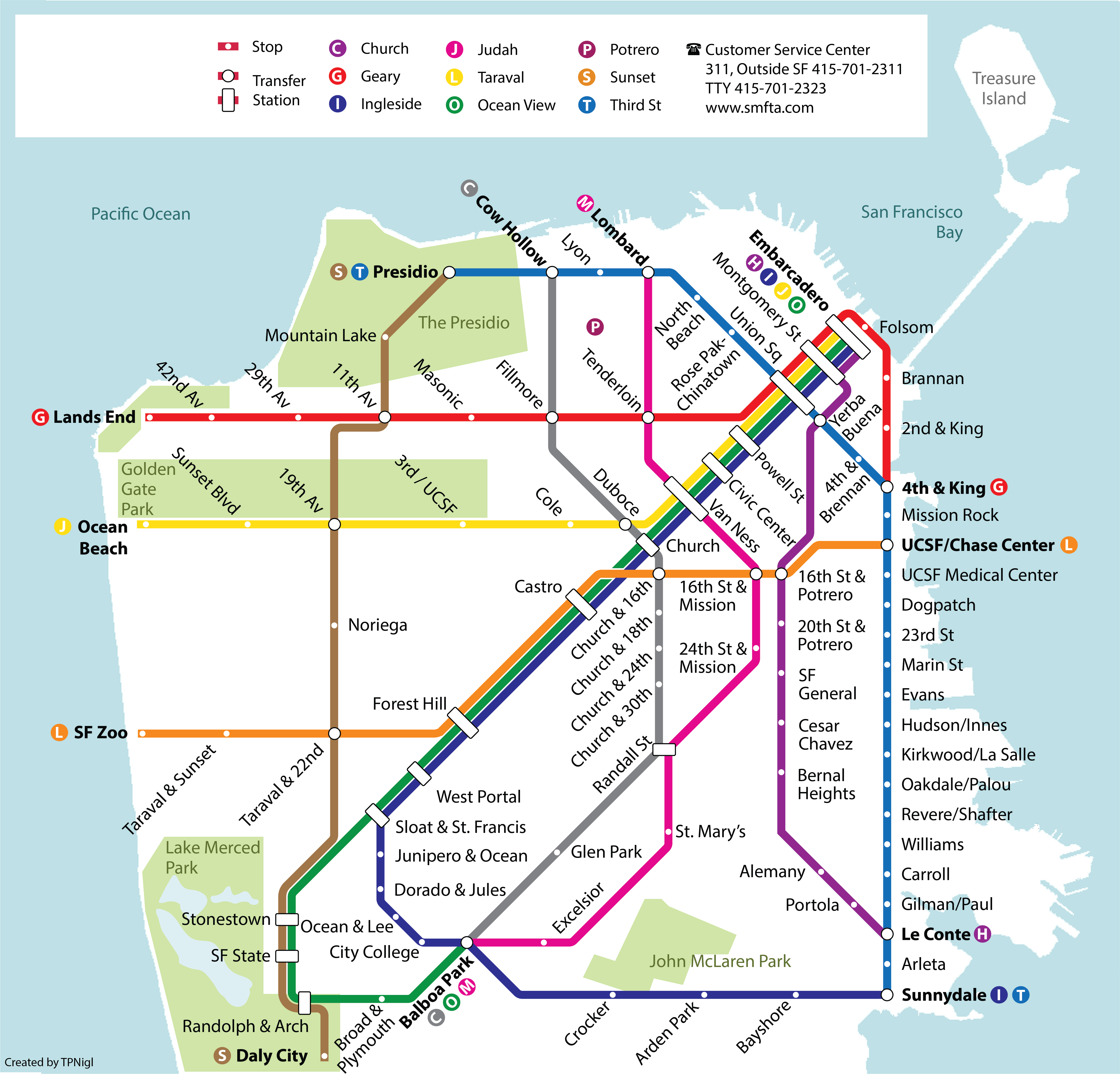
San Francisco

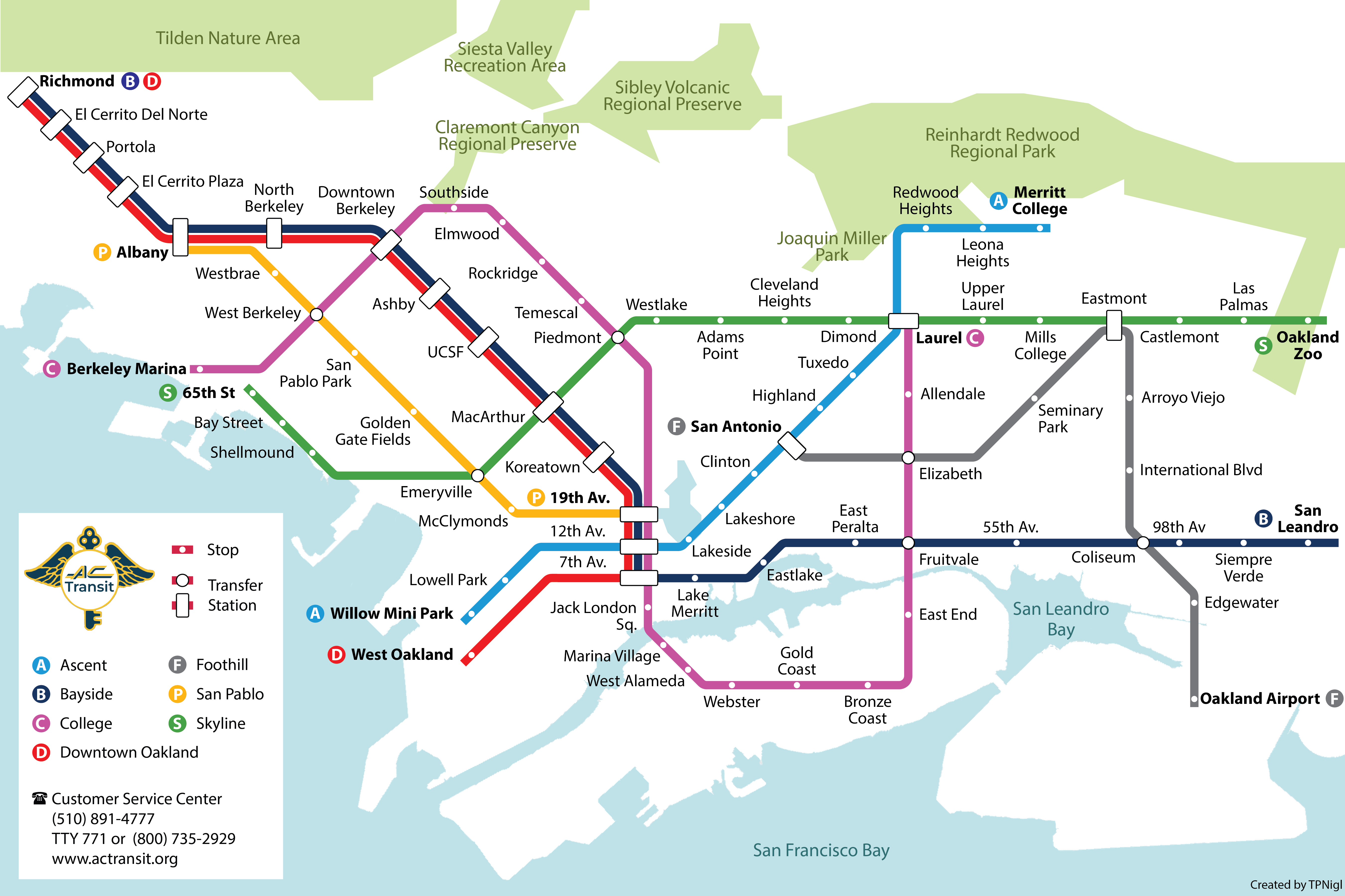
East Bay

